Ross Phelps
Service / UX / Design Leadership
Portfolio
Portfolio
Wickes are the second largest DIY specialised retailer in the UK behind B&Q, but ahead of other household brands such as Homebase and Bunnings Warehouse in terms of turnover. With a retail market share of approximately (removed for data protection) and an annual turnover of (removed for data protection) billion, Wickes is the largest brand within the Travis Perkins Building Supplies Group.
I was hired in May 2016, the brief was simple. Recruit and train a team to sit at the centre of all customer propositions; and align a CX/UX multi-channel strategy.
Important Bit: To comply with my non-disclosure agreement, I have omitted and obfuscated confidential information in this case study. All information in this case study is my own and does not necessarily reflect the views of Wickes/Travis Perkins Building Supplies Group.
As head of the project, having successfully hired and trained a team we set about further analysing the proposition as a whole, identifying customer pain-points within the service and framing the problem. The lean and focused project team which consisted of the following incredible individuals:

Senior UX Designer

UX Designer

UX Designer

Front End Developer

Insight Specialist

Customer Proposition
Wickes Kitchen proposition equates to approximately 1/3rd of all transactions within the business. With existing market insights stating that 2/3rd’s of customers purchasing a kitchen start their research online, Wickes were keen to ensure that customer journey was catered for; enhancing the shopping journey, design and customer flow from a digital perspective, alongside feeding back into the wider proposition.
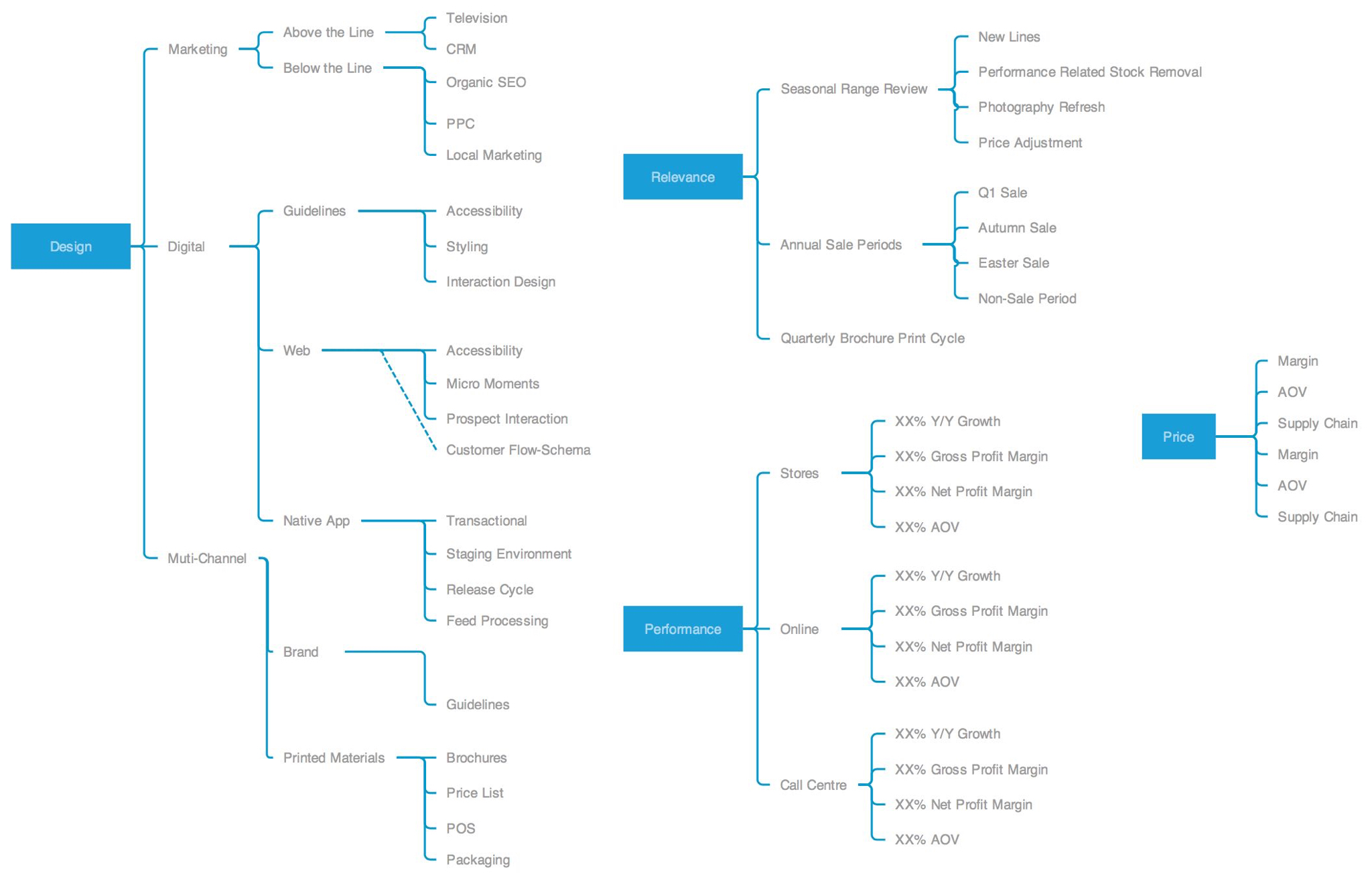
By looking into the overarching strategy of the Wickes Kitchen proposition, it became clear there are many tangible factors that could be easily enhanced to add value. The team would create a sub-model of the business canvas to generate a wider understanding of the design, relevance, performance and price of the Kitchens proposition as a whole. This would allow us to understand the business touchpoints Wickes have and determine which elements we would be able to amend as part of a phased approach to the project.
To ensure that Wickes Kitchen business is competitive, the team researched customer types alongside the competitors propositions. It is key we understood the customer to determine weather they we’re being catered for, set out in the initial brief.
Firstly, the team needed to work out who the targeted prospects were identifying the key jobs, pains and gains for key customer profiles. Our team set about aggregating data from all channels to give us our quantitative lens, we would then initiate a direct comparison with the existing customer insight data which formed more of a qualitative approach
In a store context, customer details are typically taken at the point of purchase; notably product SKU (code) and payment type. These combined metrics can be cross referenced with publicly available data which is amalgamated by a 3rd party supplier. Wickes refer to this service as a single customer view (SCV). In addition, we were able to study Google Analytics (GA) data alongside Hitwise, current market trends and pre-existing customer insights
From initial research, the team discovered that the market for buying a new Kitchen covers a diverse range of customers. Using segmentation from SCV, customers were recruited nationally to participate in qualitative panel discussions.
Market findings revealed the average age of a home improver who had purchased a Kitchen in the last 12 months had an average age of 43. With regards to the customer base within that same period, the average age totalled 58 years old. 62% of prospects made the purchase decision as a couple, where as 32% were sole decision makers. Females participants were more likely to be the final decision maker regarding brand, design or finish. More than 60% of participants interviewed would employ professional help for at least some aspect of the overall project, strengthening the business need for highlighting the installation service Wickes offer.
When researching Wickes current market position, customer brand awareness reached 90% of participants interviewed. With established specialist retailers such as Magnet reaching 80% of all prospects interviewed.
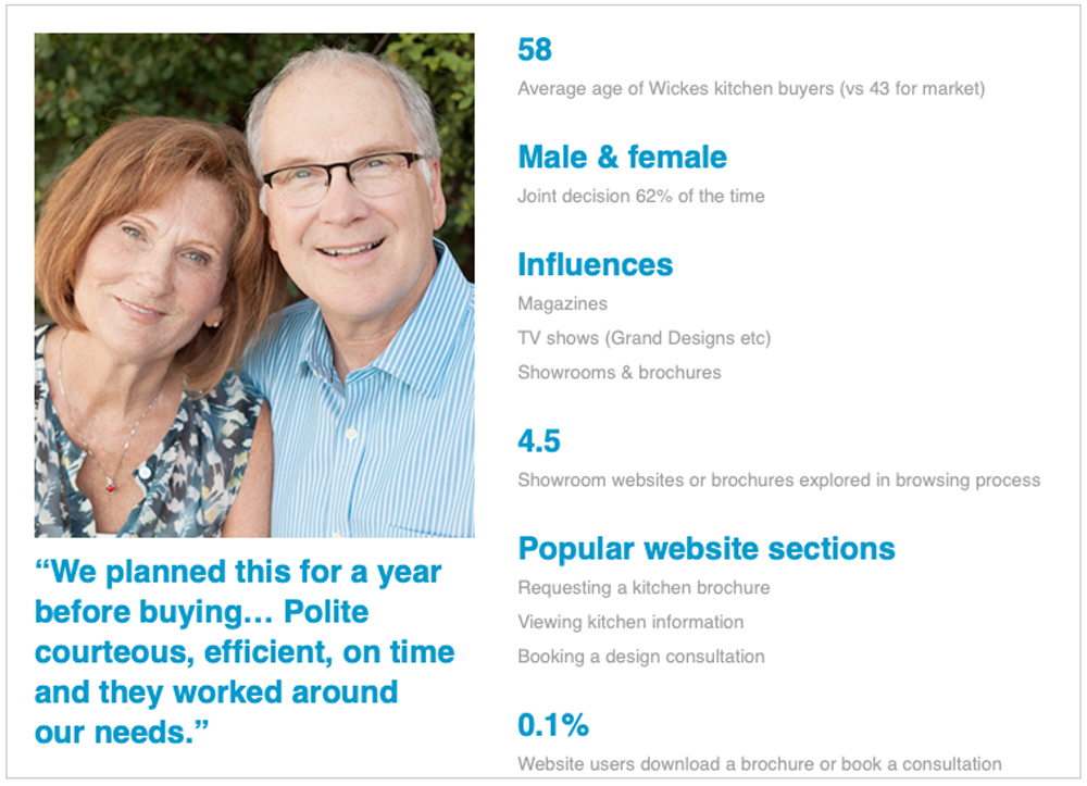
This qualitative research approach revealed potential customers investigate a number of brands; B&Q being market leaders with a consideration rating of 85%, closely followed by Wickes, Homebase and Ikea. By the time prospects are ready to purchase, their options generally narrow to focus on 2 individual suppliers. Within the initial exploration and research phase of the purchase journey over 70% of prospects narrowed their decision making through the use of online channels; it became clear Wickes needed to ensure this stage was prioritised within the conversion funnel. Wickes high brand awareness meant that the brand was likely to be investigated by customers, although this is also true of 4 other mainstream suppliers. Wickes currently has a competitive market position although evidence that their dominant position is in decline became apparent.
Quality, value and breadth of range are the key influencing factors when purchasing a Kitchen. Secondary drivers of choice covered reliability, expertise, inspiration and finance within the online offering. Even though the online channel is key within the purchase journey, the real world store showroom featured heavily in the research conducted. “I need to see it to fall in love with it, it’s a tactile thing” was feedback amongst participants. It is key that customers need to be directed to their local showroom.
From a service analysis standpoint, B&Qs core strengths lie in strong perceptions for price and range, however quality perceptions are aligned with convenience and being the market leader. Wickes offer an inspiration-to-installation solution, although when touchline-mapping the competition it became clear this is the core USP of the proposition which the team needed to cater for.
Following research and competitive analysis the team set about running a series of co-design workshops with core business stakeholders. This allowed for further gather gap analysis between research and internal opinions on who the customer is; involving stakeholders always proves to be a great success, increasing team synergy.
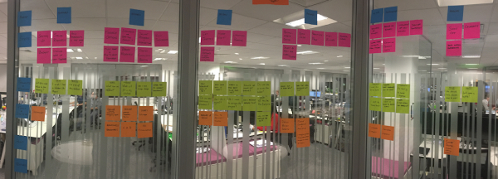
The initial sessions reframed the proposition as a whole. Stakeholders were asked to refine the existing customer journey to make it as poor as possible; this is a game-storming technique known as ‘The Anti Problem’. The session allowed the team to understand where Wickes falls short as a proposition by turning the solution on its head. Additional persona/character-profiling workshops put the user-types at the centre of the conversation; ensuring all customers were considered. Additional techniques we used within the co-design phase of the process included team sketching, and stakeholder paper prototyping; with the output eventually bleeding into the sketching and wire-framing section of the project.
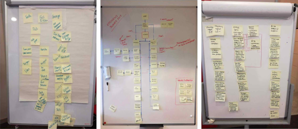
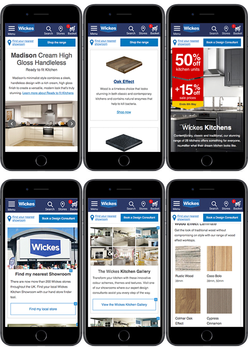
Following the proposition analysis and co-design sessions the team set about using all aggregated data to produce a series of sketches. The process was defined by creating components which would be used within the future responsive site framework. Once finalised, the first draft of components were then photocopied and turned into paper prototypes for layout mapping subject to serious scrutiny from peer review..
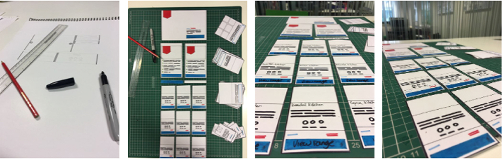
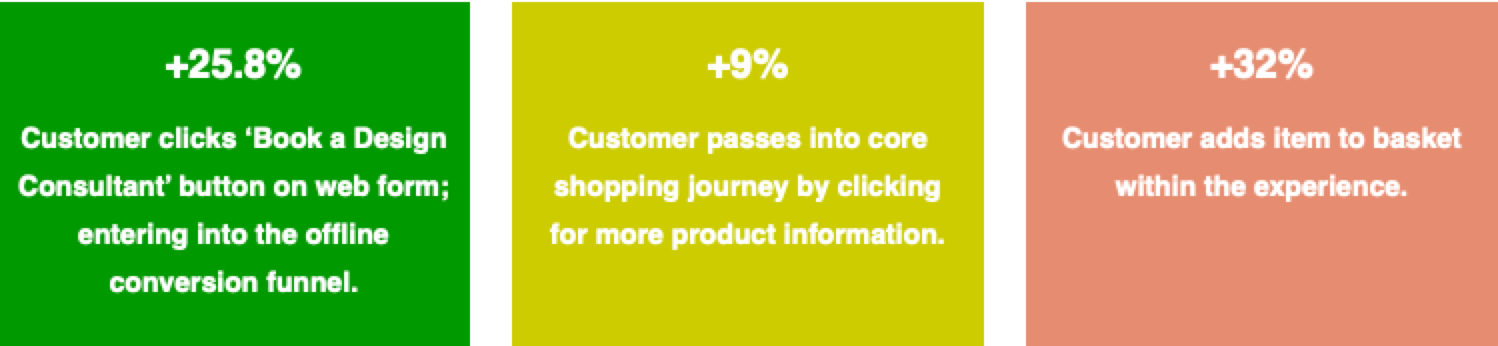
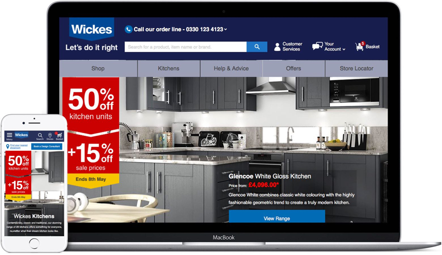
Now we had a framework to work within, the team created developed some mid-fidelity wireframes within Axure. Working to a 24 column grid the digitisation process was really smooth. We played with the outputs over 3 iterations making sure we had taken the proposition and customer research into account for both Ready to Fit and Showroom products. Key research from the current proposition indicated that users struggled to book a design consultation; by increasing the prominence of this link on both mobile, tablet and web was key to exceeding project KPIs. Using regular show and tell sessions with developers to ensure all proposed interactions were possible, we rapidly grew into a position where we were comfortable with the output; keeping stakeholders engaged throughout the sign-off process.
I love prototyping! That and reminiscing about the days of the wild west internet when Macromedia Flash was king (I’m showing my age!). Making designs come to life was and still is an incredible amount of fun, like playing the toys as a child and seeing your imagination come to life in front of you. The level of detail through the use of variables and interaction design techniques makes the handover to developers seamless. Particularly if English isn’t their first language.
I’ve used Axure Pro RP8 for around 6 years and find it to be an incredible tool, between this, HTML and Marvel (and many others); as a designer you can achieve anything. The team set about adapting the mid-fi Kitchen experience wireframes into Axure, creating a free roam prototype for testing. This was then peer-reviewed and demonstrated to the moderator of the usability testing sessions; giving a clear mandate regarding to what we aspire users to achieve.
The team set about using the profiles obtained through the customer research and discovery phase of the project as a clear guidline for recruiters to match criteria against. It was essential that we included a couple alongside single participants. The decision to studio test was taken to make the session as contextual as possible, before an A/B test could be established.
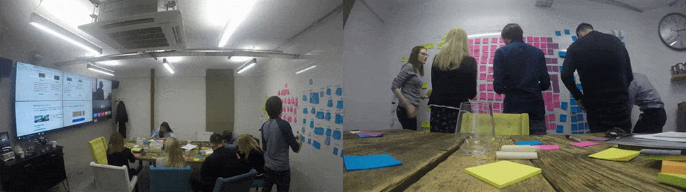
Sessions were held at ‘The Insight Rooms’ on Old Street in London and hosted across 3 days with each consisting of x5 participants (plus x1 spare). At top line each participant evaluated, individual components regarding inspirational content, page structure and the full customer journey related to the proposition.
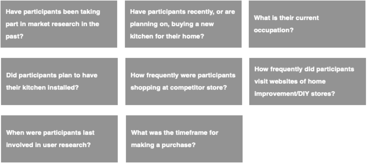
From a recruitment perspective, it was key that the team had the best quality feedback from relevant customers. Putting together a recruitment screener we directed our consultants as to customer types we were looking for:
As part of the screener subjects were asked a range of questions to justify their suitability. Ideally we wanted to recruit as many users as possible who were currently in the process of a purchase decision, the team were happy if customers had completed a Kitchen related project in the last 3 to 6 months; ensuring we maintained the highest quality of feedback. We then added the following questions as part of the recruitment screener.
The prototype produced allowed users to freely roam the experience, passing variables from page to page with mid to hi-fidelity finish. This would give participants the impression they were looking at a finished experience. As part of the test, a discussion guide was then produced to highlight pain-points within the wider customer journey. From a contextual standpoint the team needed to get findings to the following questions.
The moderators then ran sessions with participants, while the full team ran co-design workshops in a video linked room. Facilitating this session I asked all team members to post-it positives, negative and observations in relation to the discussion guide. For the final session the team invited all Wickes senior management along to partake. Testing would prove to be a resounding success.
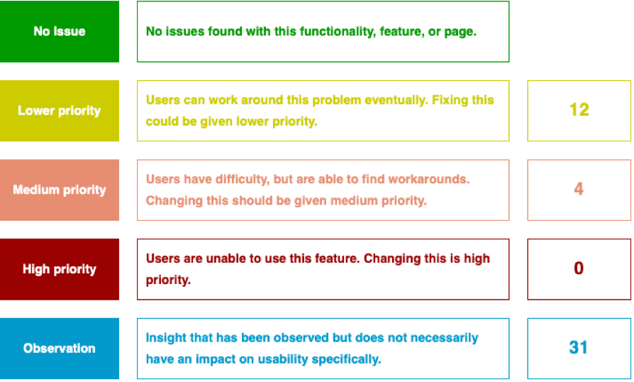
ollowing usability and proposition testing of the experience as a whole, the team sat and worked through a range of issues that had been highlighted. We were able to then break these down into specific categories.
The proposed experience tested well, key findings around the proposition and customer requirements were highlighed throughout the course of the test. Wickes were perceived by participants as providing inspiration within the new experience. However, there was a reported shortfall in this service across the participant population due to the absence of an online tool that enabled a simulation or model of their kitchen design.
The team considered adding functionality that enables the user to model kitchen design ideas. Which would potentially help the inspiration and research phase of the customer experience and also aid the transfer across to the offline, store experience. This would be added at a later phase
Additional feedback also focused on the opportunity to filter kitchen ranges, this was well received by participants.
However, this feature was not immediately noted by all participants; there was a need for the moderator to point the participant to it. Its position on the page i.e. ahead of the range images meant that for one participant couple (p5/6) it was deemed unclear as to what to filter on as there was uncertainty as to the extent of styles and prices available on the site. The solution, review the current presentation of the filter functionality: it should be salient so as to be a call to action. Fleshing out the current ‘skeleton’ format of the table with colour may increase visibility on the page, where it is currently ‘nested’ between the ‘What’s right for you’ table and the range image list.
The team then broke down what was achievable for launch from the full list (not shown), and then iterated on various data points. We then produced a full UI Kit ready for development.
A/B testing was initiated through the Monetate platform and initially ran on a 90/10 split (in favour of control). It has since moved to 50/50. Iterations are continuing to be made as we identify pain points within the journey..